Nick+ Streaming Platform Launch
Departing from their successful Nickelodeon TV channel, they were expanding their brand through a streaming platform in Canadian market to distribute their popular contents. My team was responsible for building the front end of the product, creating a new logo, logo tag animation and web/digital asset. My role in this process is, designing the logo, storyboarding and 3D modeling/animation. We tried best to maintain the fun energy of the original brand and here is the process.
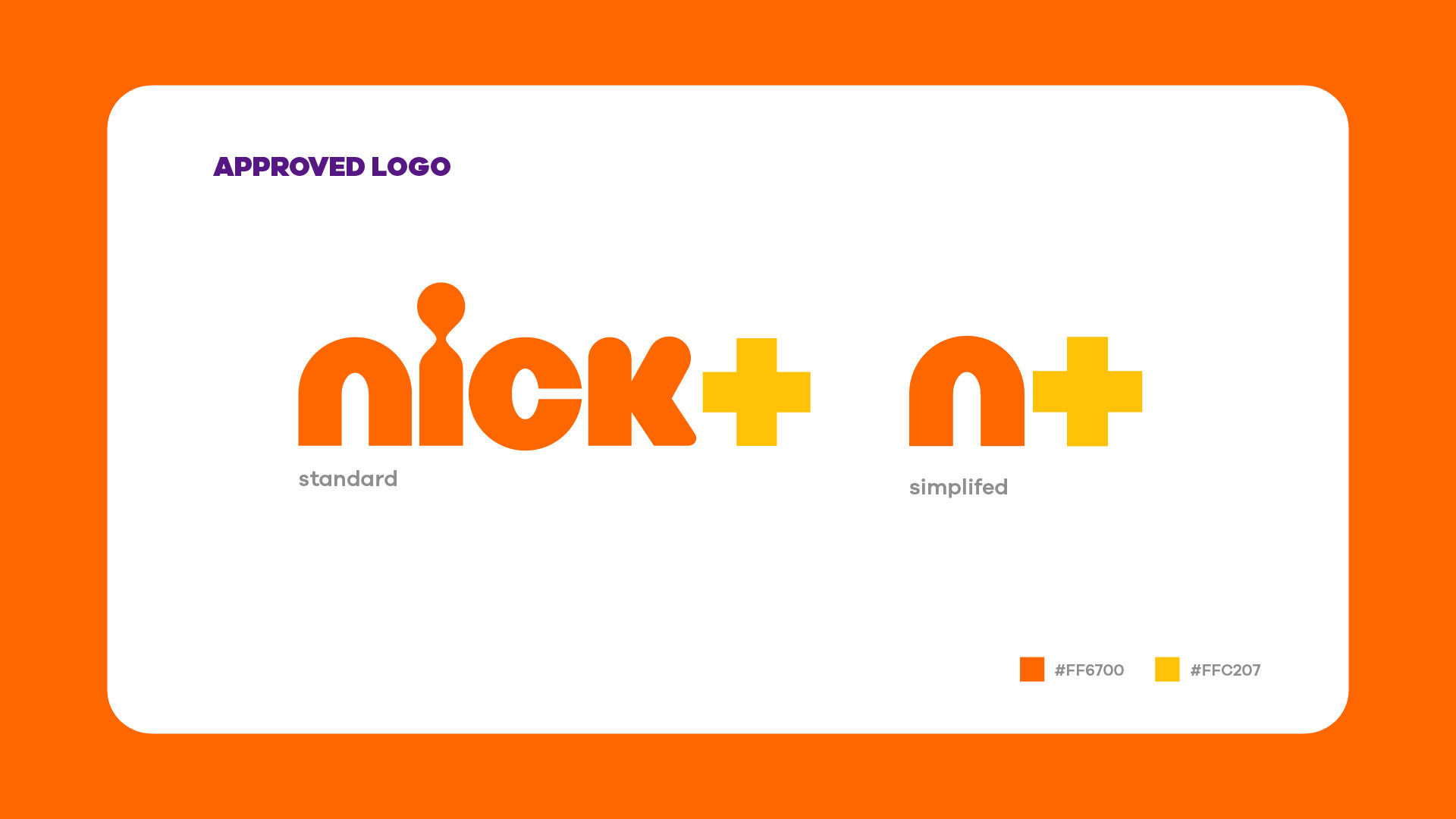
Nick+ Logo + ID


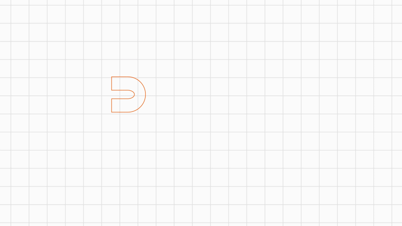
First Animatic Attempt: The "Plus" sign coming out of K like a cannon idea from storyboard required morphing for the letter which counters Tetris/rigid personality of the animation. Therefore the cannon idea is removed. The emphasis was given to “plus” sign too much this test and disturb overall rhythm of the letter introduction.
Refined Animatic: The "plus" sign linger less in air and making the overall flow better. The "plus" sign lands with more impact.
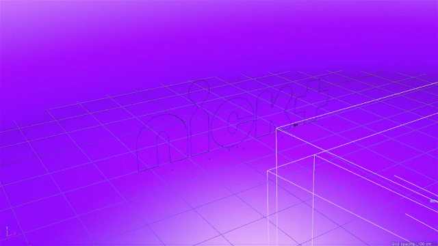
3D light set up & animation test. The 3 different background combination was created: Purple, Light Blue and Peach. The renders were outputted with multi layers like highlight, shadow, and bump layer for precise control in post production.
2D Animation Application.
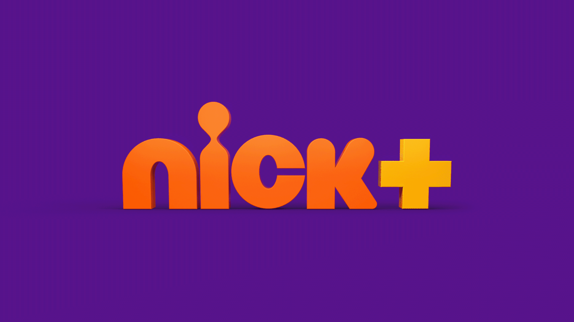
Logo Tag Final Result
Creative Director: Vince Robles
Art Director: Kevin Burgess
Producer: Michael Frolick
Design, Storyboarding, 3D Animation,. Francisco Park.
Art Director: Kevin Burgess
Producer: Michael Frolick
Design, Storyboarding, 3D Animation,. Francisco Park.